- Joined
- May 7, 2018
- Messages
- 5,150
Landing pages can be one of an affiliate media buyer's most valuable assets. They'll give you valuable insights that are impossible to obtain without.
However, being the super lazy creatures us affiliates are, many newbies choose not to use landing pages in their campaigns at all. Creating landing pages would mean that you have to learn HTML/CSS/JS, and that means it'll take you longer to make campaigns.
Unfortunately, if you're planning on doing affiliate marketing over the long term (and actually making it) you're going to have no choice but to learn very basic coding so you can reap the benefits of landing pages.
In this thread, I'd like to explain why landing pages are valuable to you as a media buyer, how you can get started using them, and I'll also show you a few popular examples to get you off to a good start.

The offer flow may be simple, but truth be told most offer pages don't do a good job at all converting ice-cold traffic. Yes, even if the user just has to enter their email address.
Let's bring in an example:
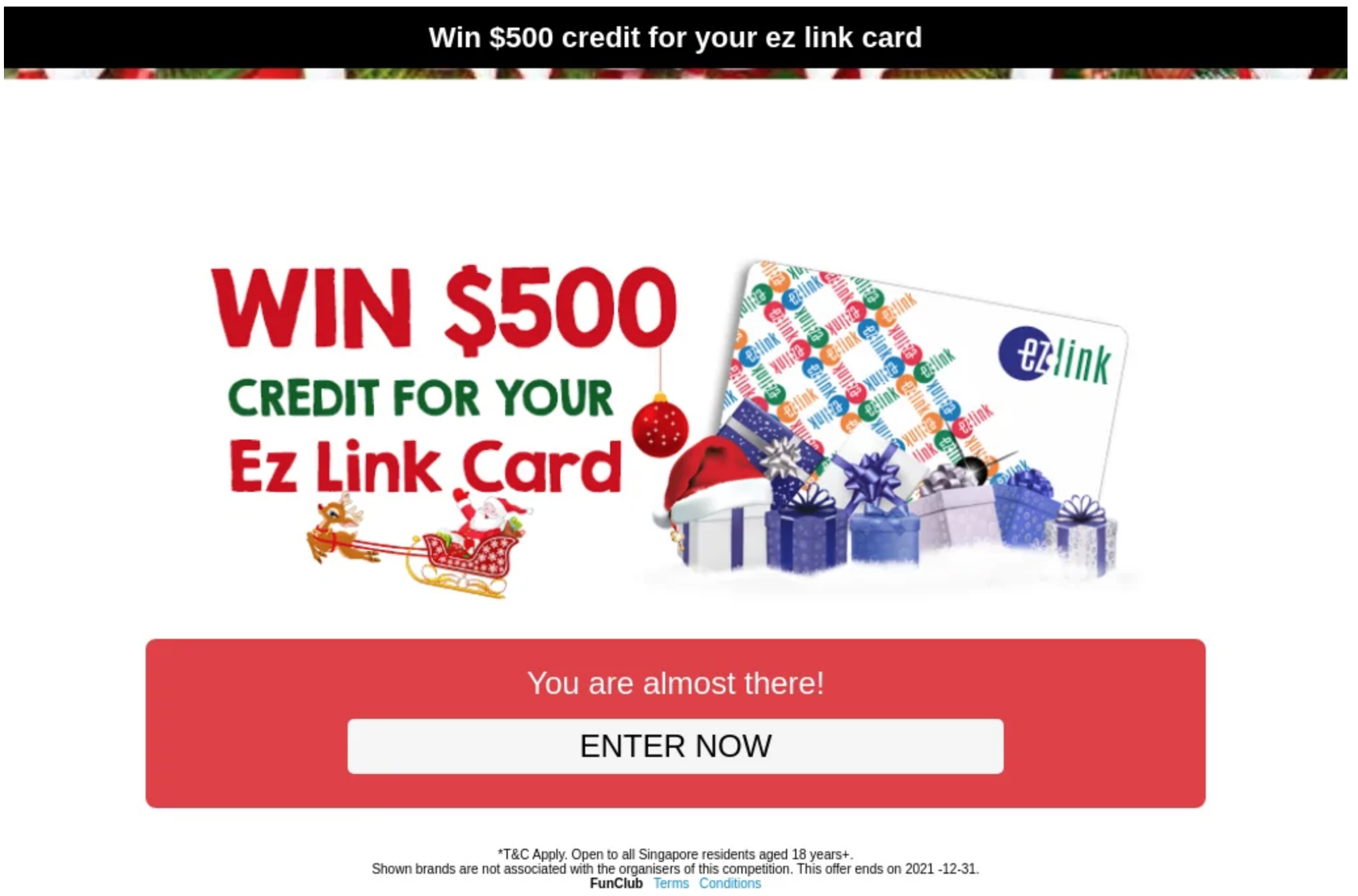
You see, on this offer page you simply have to click the button and you can enter your contact details (i.e. email address) and you'll be entered to win a $500 gift card.
Sounds simple, right?
Some people will convert, of course, but not enough for you to make much profit if any at all. Why not? They only have to enter their email address...
Put yourself in the shoes of someone who just received a push notification, or you were browsing a torrent website to find a movie to watch on Friday night. A message pops up "Win $500...". You weren't looking to enter sweepstakes and win prizes; you had other plans. Your intent to complete that offer is very low. You might even wonder why you're even being offered to win so much money.
Now imagine you received a notification that says "Congratulations! You're 1 of 10 users selected to win $500. Just complete this 3 question survey about XYZ, your favorite company". Or maybe, "find the $500 cash in the box and it's yours!".
Both of these examples are what we call angles. Angles allow you to position the offer as a necessity for the end-user. They'll help you convert more users, making you more money. While this can somewhat be done with an ad format that has creatives (push, native, etc.), it all really only comes together when you also have a landing page reinforcing the same angle of the creative.
This is actually one of the many reasons why advertisers turn to affiliates to promote their offers. Just think... if their offer page by itself converted so well why do they need your help to run the exact same funnel they can run themselves?
The next advantage a landing page gives you is more data. The data gathered will help you optimize your campaigns better.
You'll be able to see if users even interact with the page at all, if there are bots, see CTR rates, and you can split test various page designs to see what's most appealing to the users. Split testing page designs is something that's just not possible if you're direct linking.
Armed with this additional data in your hands you're able to remove suspicious segments from your campaigns when optimizing, allowing you to reach the green zone faster with less test budget.
Finally, a landing page allows you to better monetize your funnel. When you can monetize your funnel more effectively, you can bid higher, giving you more traffic (and profit).
The main way to add additional monetization (anything that makes money apart from conversions on your main offer) is done with various landing page scripts, such as a back button redirect, a popunder/popover, push subscription collection, etc.
Over the past few years, push collection has been an essential element of an affiliate campaign. The revenue this can add to your campaigns can be close to 30%. When you're able to add that much additional revenue to your campaign running campaigns become much easier. You're no longer reliant on a single source (your main offer) to bring your ROI into the green. That means you can actually have a negative ROI on your main offer, and be brought into the green with your push subscription collection, or other scripts.
Some affiliate networks might have landing pages they host that you can use with your offers. But, this is a big mistake on your part because you're unable to get the full value of landers when it's hosted on someone else's server. They're able to add their own additional monetization scripts (and they do), and you're not going to see a single cent of that revenue be credited to your account.
The value I've outlined above are some of the major reasons why you should be using landing pages in your campaign. If that's not enough just think about this: as an affiliate, what value are you bringing to the table? When you're direct linking you bring no more value than the next direct link affiliate. Don't you think everyone would be rich AF if running campaigns was as simple as copy and pasting links?
I mentioned at the start of this post that you'll probably need to learn HTML/CSS and Javascript if you're going to use landing pages. It's not a requirement, as there are many landing page builders (like this one) that you can use.
In my opinion, even if you use a landing page builder you'll still get benefit from knowing the basics of HTML/CSS and Javascript. You don't have to be able to code a full page from scratch.
When I say basics I mean the general format and syntax. It's enough knowing the absolute basics to get by and enable you to be able to Google the solution to anything you want to do.
For example, maybe you want to add a dashed border to a box. You'd just Google search "css dashed border" and you'll quickly find some code samples. Since you know the basics of CSS you can copy and paste the needed parts of those samples into your lander so it works as you need.
Almost every code-related question is a Google search away. Stackoverflow is your friend (it comes up as the first search result for nearly everything).
To learn the basics of HTML, CSS, and Javascript I suggest using the free courses at Codecademy (this is exactly how I learned):
No matter if you're coding landers yourself, ripping and cleaning landers, or using a landing page builder, you'll need some kind of web hosting once your lander is ready to use.
There are a lot of options for this. Here are some step-by-step guides:
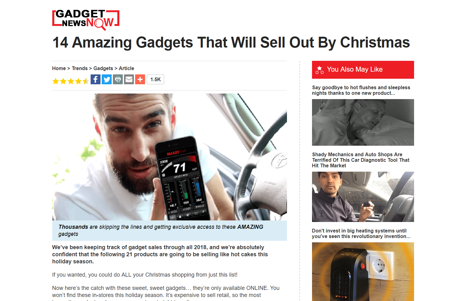
A listicle is similar to an advertorial, but instead of promoting 1 single product/service, it's a "list" of products and services. Sometimes these pages act more as pre-landers and after you click on one of the products in the list you go to a dedicated landing page for said product.
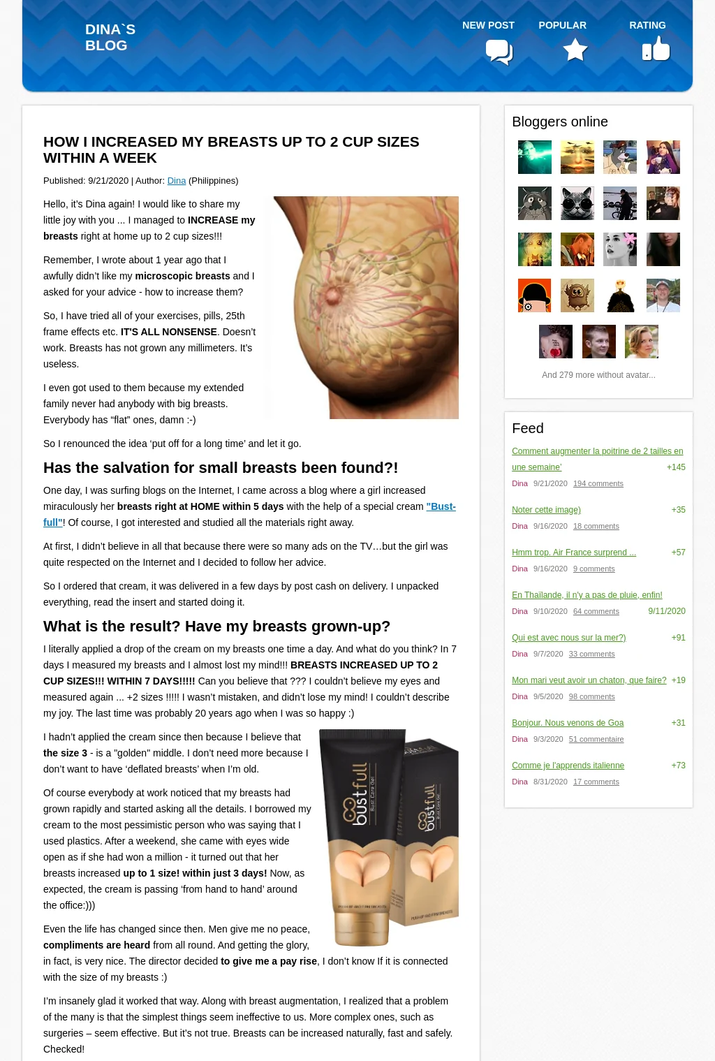
A flog is a fake blog. Unlike advertorials that typically appear on large news-like websites, flogs are meant to look like someone's personal blog.
Quizzes and survey landers are used in many verticals. They are meant to help warm the user up to the offer by asking questions.
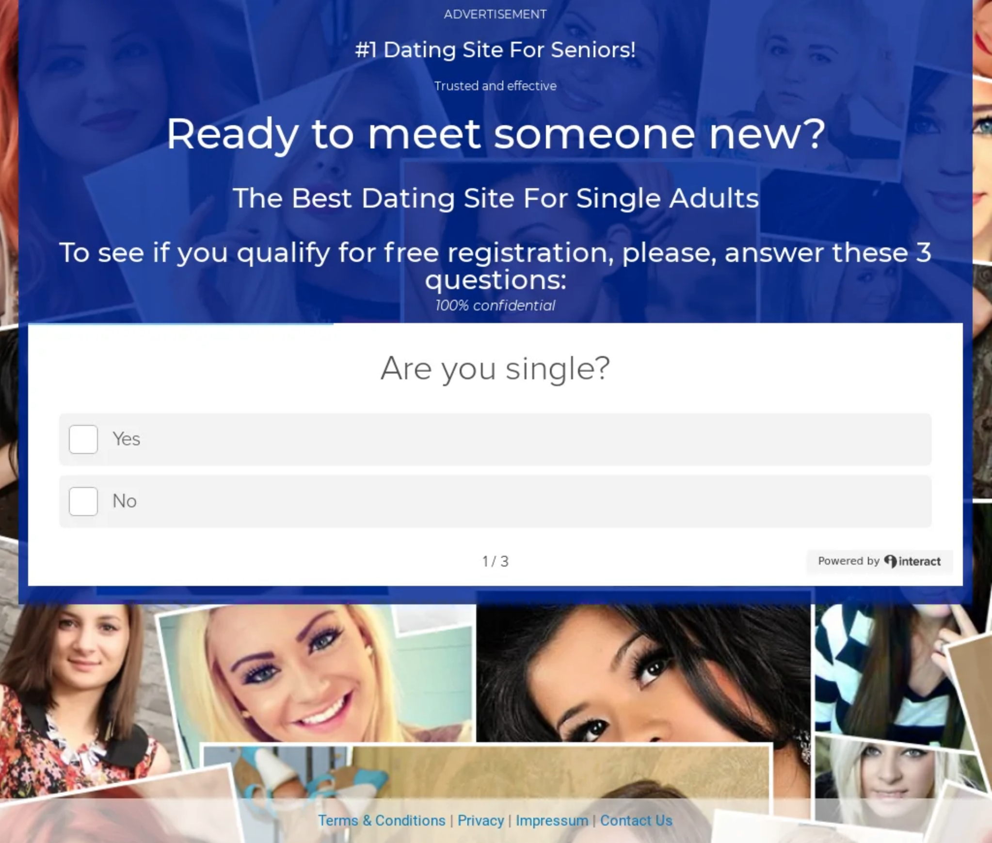
Click-through or bridge pages are very simple landing pages. Typically, they don't have much text and the CTA button is visible above the fold.
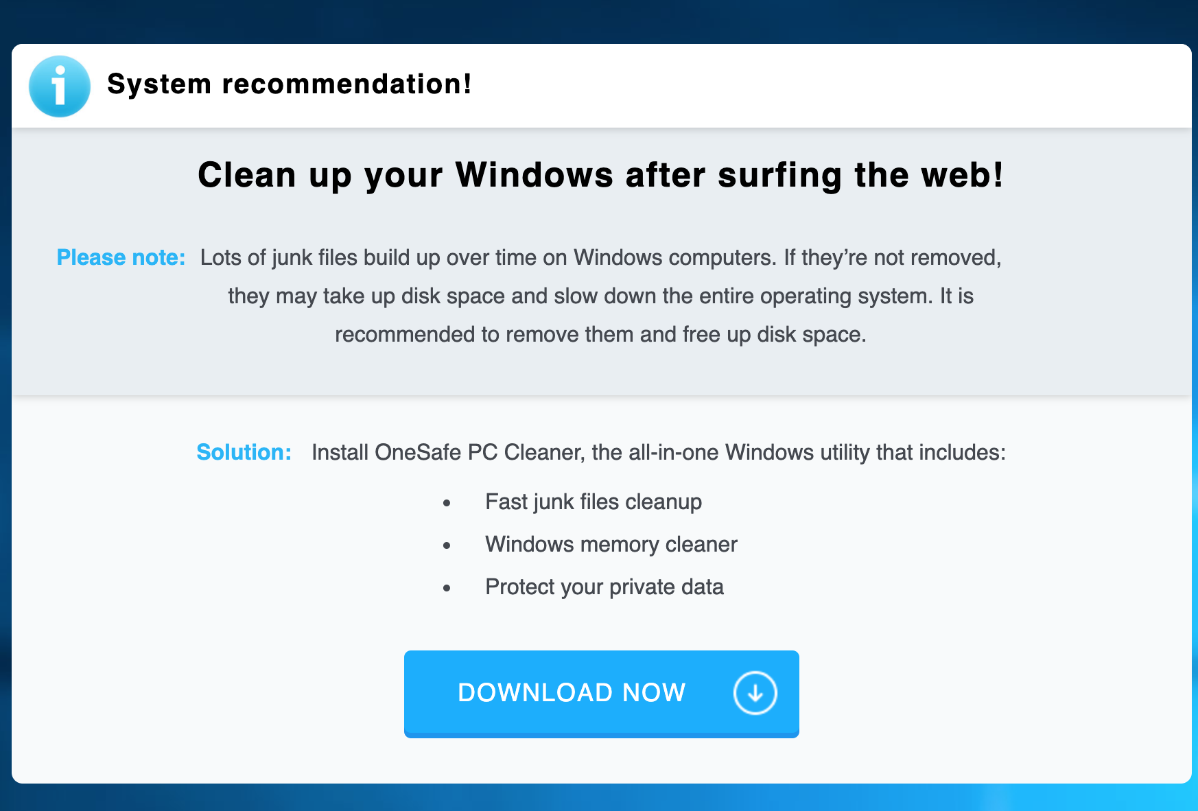
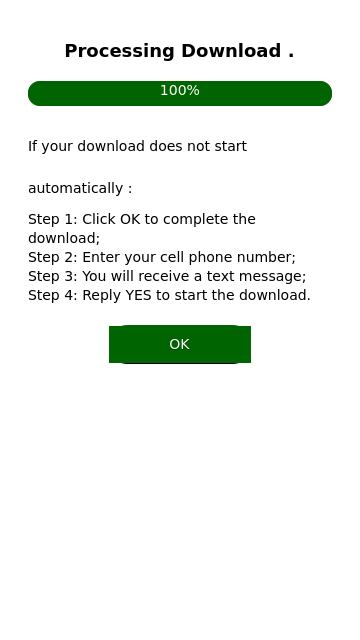
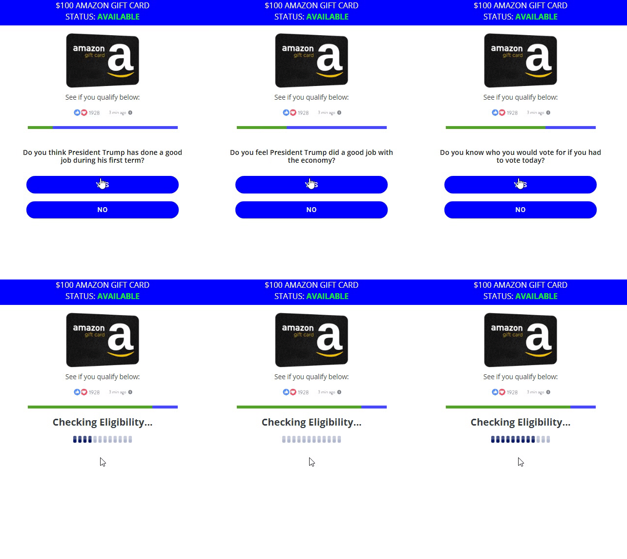
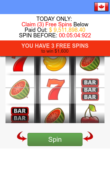
There are a lot of types of interactive landing pages. As the name suggests, these landers require the user to interact with the landing page to get access to the offer.

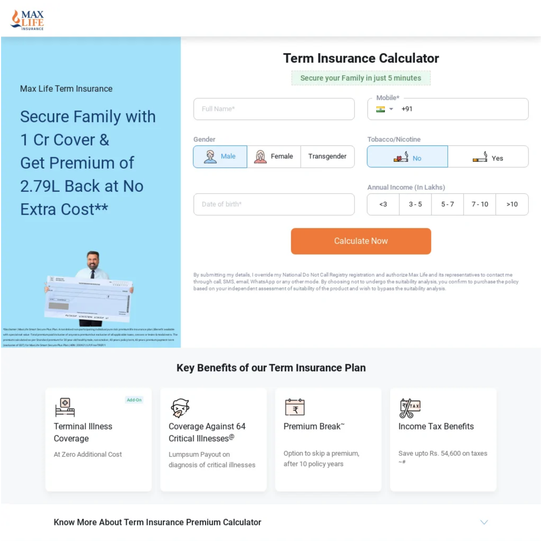
Lead capture pages and designed to extract information from the user that you can use for later marketing purposes, for example, sending emails for offers relevant to a user's attributes.
The best place to find good landing pages is with a spy tool. If you're running push traffic, use this. If you're running pop traffic, use this.
If your budget is tight, you can also download over 200 landing pages for free in this thread to get you started. You'll also find a lot more scattered through the landing pages section of the forum.
Need more examples of the popular landing page types above? You're welcome.
In my opinion, landing pages are almost always a critical element of your campaign to extract the most money possible from the traffic you're already paying for.
A good landing page will pre-sell and warm the user up to the offer before they even see it. Once they're on the offer page they don't need to read the terrible, unconvincing copy that's likely there. They already know they need the offer since your landing page convinced/sold/motivated/persuaded them and told them why then need it.
However, being the super lazy creatures us affiliates are, many newbies choose not to use landing pages in their campaigns at all. Creating landing pages would mean that you have to learn HTML/CSS/JS, and that means it'll take you longer to make campaigns.
Unfortunately, if you're planning on doing affiliate marketing over the long term (and actually making it) you're going to have no choice but to learn very basic coding so you can reap the benefits of landing pages.
In this thread, I'd like to explain why landing pages are valuable to you as a media buyer, how you can get started using them, and I'll also show you a few popular examples to get you off to a good start.
The value of a landing page
Apart from new affiliates not wanting to learn the basics of coding to make landing pages, another big objection I often hear is "why should we use a landing page when the offer flow is super simple?".The offer flow may be simple, but truth be told most offer pages don't do a good job at all converting ice-cold traffic. Yes, even if the user just has to enter their email address.
Let's bring in an example:
You see, on this offer page you simply have to click the button and you can enter your contact details (i.e. email address) and you'll be entered to win a $500 gift card.
Sounds simple, right?
Some people will convert, of course, but not enough for you to make much profit if any at all. Why not? They only have to enter their email address...
Put yourself in the shoes of someone who just received a push notification, or you were browsing a torrent website to find a movie to watch on Friday night. A message pops up "Win $500...". You weren't looking to enter sweepstakes and win prizes; you had other plans. Your intent to complete that offer is very low. You might even wonder why you're even being offered to win so much money.
Now imagine you received a notification that says "Congratulations! You're 1 of 10 users selected to win $500. Just complete this 3 question survey about XYZ, your favorite company". Or maybe, "find the $500 cash in the box and it's yours!".
Both of these examples are what we call angles. Angles allow you to position the offer as a necessity for the end-user. They'll help you convert more users, making you more money. While this can somewhat be done with an ad format that has creatives (push, native, etc.), it all really only comes together when you also have a landing page reinforcing the same angle of the creative.
This is actually one of the many reasons why advertisers turn to affiliates to promote their offers. Just think... if their offer page by itself converted so well why do they need your help to run the exact same funnel they can run themselves?
The next advantage a landing page gives you is more data. The data gathered will help you optimize your campaigns better.
You'll be able to see if users even interact with the page at all, if there are bots, see CTR rates, and you can split test various page designs to see what's most appealing to the users. Split testing page designs is something that's just not possible if you're direct linking.
Armed with this additional data in your hands you're able to remove suspicious segments from your campaigns when optimizing, allowing you to reach the green zone faster with less test budget.
Finally, a landing page allows you to better monetize your funnel. When you can monetize your funnel more effectively, you can bid higher, giving you more traffic (and profit).
The main way to add additional monetization (anything that makes money apart from conversions on your main offer) is done with various landing page scripts, such as a back button redirect, a popunder/popover, push subscription collection, etc.
Over the past few years, push collection has been an essential element of an affiliate campaign. The revenue this can add to your campaigns can be close to 30%. When you're able to add that much additional revenue to your campaign running campaigns become much easier. You're no longer reliant on a single source (your main offer) to bring your ROI into the green. That means you can actually have a negative ROI on your main offer, and be brought into the green with your push subscription collection, or other scripts.
Some affiliate networks might have landing pages they host that you can use with your offers. But, this is a big mistake on your part because you're unable to get the full value of landers when it's hosted on someone else's server. They're able to add their own additional monetization scripts (and they do), and you're not going to see a single cent of that revenue be credited to your account.
The value I've outlined above are some of the major reasons why you should be using landing pages in your campaign. If that's not enough just think about this: as an affiliate, what value are you bringing to the table? When you're direct linking you bring no more value than the next direct link affiliate. Don't you think everyone would be rich AF if running campaigns was as simple as copy and pasting links?
How to get started with landing pages
I mentioned at the start of this post that you'll probably need to learn HTML/CSS and Javascript if you're going to use landing pages. It's not a requirement, as there are many landing page builders (like this one) that you can use.
In my opinion, even if you use a landing page builder you'll still get benefit from knowing the basics of HTML/CSS and Javascript. You don't have to be able to code a full page from scratch.
When I say basics I mean the general format and syntax. It's enough knowing the absolute basics to get by and enable you to be able to Google the solution to anything you want to do.
For example, maybe you want to add a dashed border to a box. You'd just Google search "css dashed border" and you'll quickly find some code samples. Since you know the basics of CSS you can copy and paste the needed parts of those samples into your lander so it works as you need.
Almost every code-related question is a Google search away. Stackoverflow is your friend (it comes up as the first search result for nearly everything).
To learn the basics of HTML, CSS, and Javascript I suggest using the free courses at Codecademy (this is exactly how I learned):
No matter if you're coding landers yourself, ripping and cleaning landers, or using a landing page builder, you'll need some kind of web hosting once your lander is ready to use.
There are a lot of options for this. Here are some step-by-step guides:
Popular landing page types
If you open up any spy tool you'll find thousands of landing pages that you can use in your campaigns. There are many different designs, but if you look closely you can see most of them will fall into the following categories:Advertorial
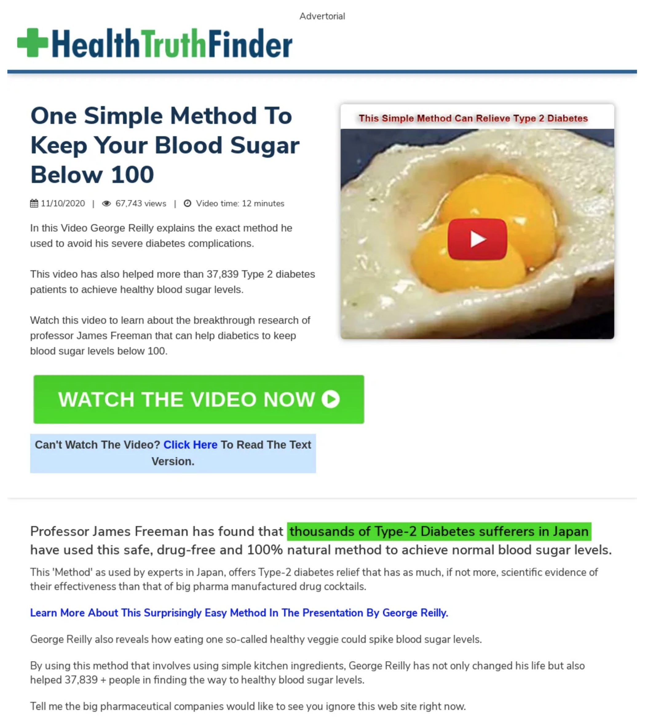
An advertorial is an advertisement for a product/service disguised to look like a real article that you'd read on any news website. Many times the content is fake or exaggerated.Listicle
A listicle is similar to an advertorial, but instead of promoting 1 single product/service, it's a "list" of products and services. Sometimes these pages act more as pre-landers and after you click on one of the products in the list you go to a dedicated landing page for said product.
Flog
A flog is a fake blog. Unlike advertorials that typically appear on large news-like websites, flogs are meant to look like someone's personal blog.
Quiz/Survey
Quizzes and survey landers are used in many verticals. They are meant to help warm the user up to the offer by asking questions.
Click through or bridge page
Click-through or bridge pages are very simple landing pages. Typically, they don't have much text and the CTA button is visible above the fold.
Interactive
There are a lot of types of interactive landing pages. As the name suggests, these landers require the user to interact with the landing page to get access to the offer.
Lead Capture
Lead capture pages and designed to extract information from the user that you can use for later marketing purposes, for example, sending emails for offers relevant to a user's attributes.
The best place to find good landing pages is with a spy tool. If you're running push traffic, use this. If you're running pop traffic, use this.
If your budget is tight, you can also download over 200 landing pages for free in this thread to get you started. You'll also find a lot more scattered through the landing pages section of the forum.
Need more examples of the popular landing page types above? You're welcome.
Are you a believer?
Have I finally convinced you that you should be using landing pages in your campaigns?In my opinion, landing pages are almost always a critical element of your campaign to extract the most money possible from the traffic you're already paying for.
A good landing page will pre-sell and warm the user up to the offer before they even see it. Once they're on the offer page they don't need to read the terrible, unconvincing copy that's likely there. They already know they need the offer since your landing page convinced/sold/motivated/persuaded them and told them why then need it.
Last edited by a moderator:


