


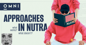
A creative is the first element of the sales funnel that a user interacts with. How well you grab their attention and address their triggers determines whether they’ll proceed to the pre-landing or not. In this article, we’ve gathered all popular creative approaches with examples from SPY tools, along with commentary from our media buying team lead, Dmitry, on what will pass the moderation, what won't, which creatives work, and which need improvement. Trust us, it’s worth the read!
To boost effectiveness, add additional elements like a glucose meter showing sugar levels before (9) and after (4) using the product. This visual reinforcement strengthens the message.


Use neutral imagery, like someone applying ointment or stock photos highlighting ingredients (e.g., camphor).

For example, we show a sore and add text: "Arthrosis is treated in such and such a way." That is, you specifically demonstrate a problem, such as arthrosis, bursitis, or cardiovascular diseases. For the latter, an X-ray of the heart can be used to show a blood clot or other issues.


This approach also contributes to an increase in CTR, as viewers recognize popular television hosts and are more likely to click on such ads. Additionally, adapting the pre-landing page to local news and using a news format in the creative not only increases click-through rates but also improves the conversion rate of the pre-landing page itself.


Two-dimensional graphics are often used. For example, initially large, semi-transparent sides are shown, then they shrink, and finally, a slim body becomes visible. This approach might pass moderation.


ChatGPT can draw tonometers, graphs, a doctor, visualize a heartbeat or pulsation in a teaser approach, or use a "before and after" format. However, X-ray images do not always pass moderation now, as they often cause negative reactions.
Overall, using illustrated graphics is quite effective, but it all depends on the specific situation and the principle you want to use.


That's all for now. Register with the OMNI CPA affiliate network or write to our managers directly: Dima, Jane, or Emily and start driving traffic to direct Nutra offers!
1. Teaser Approach
The teaser approach is one of the most effective (and popular) methods. The main idea is to focus on folk remedies and "grandma’s recipes." For example, in an ad targeting diabetics, you could highlight the benefits of eating small amounts of lard. While lard isn’t widely loved in Europe, people from post-Soviet countries subconsciously associate it with something good and familiar—making the ad more attention-grabbing.To boost effectiveness, add additional elements like a glucose meter showing sugar levels before (9) and after (4) using the product. This visual reinforcement strengthens the message.
2. Medical/Doctor Approach
This concept overlaps a little with teasers. For example, featuring a well-known doctor with a product while hinting at scientific backing (e.g., "Proven to help you live to 110!").3. Product-Centric Approach
A straightforward showcase of the product, often blending with teasers but with lower conversion rates (though higher approval rates). It’s a "clean" format with CTAs like "Buy now!" or "Your skin needs this!"Use neutral imagery, like someone applying ointment or stock photos highlighting ingredients (e.g., camphor).
4. Symptom-Focused Approach
In this case, the emphasis is placed on a specific disease. This approach is based on attracting attention by demonstrating pain and discomfort, in order to evoke the viewer's desire to find a solution.For example, we show a sore and add text: "Arthrosis is treated in such and such a way." That is, you specifically demonstrate a problem, such as arthrosis, bursitis, or cardiovascular diseases. For the latter, an X-ray of the heart can be used to show a blood clot or other issues.
5. Consequences of Neglect Approach
It is extremely difficult to use this approach now. Some platforms ban advertisements for evoking negative emotions. Such creatives often include flows such as: "This is what will happen to your body if you do not buy this ointment." A classic example of this approach is used in medical pre-landing pages for prostatitis, which state that an advanced disease can lead to serious consequences.6. News-Style Approach
The news-based approach creates a sense of credibility and relevance. People are accustomed to trusting the news, and this trust can be transferred to advertising. If the creative demonstrates that news sources are covering our product "X," it will significantly increase trust in the advertisement.This approach also contributes to an increase in CTR, as viewers recognize popular television hosts and are more likely to click on such ads. Additionally, adapting the pre-landing page to local news and using a news format in the creative not only increases click-through rates but also improves the conversion rate of the pre-landing page itself.
7. Pills/Ointments Approach
The approach with pills and ointments can be compared to teaser and product-focused approaches. They share similar characteristics, but there are two main flows:- Ointments in a "white-hat" style. The ointment itself is advertised, as in product-focused advertising, but with high-quality imagery. For example, a visually appealing picture of a tube of "Fledox" or a bottle of "Cardirin" with a detailed description of the product and its action. In the background, there might be a person engaged in sports to emphasize the product's effectiveness.
- Teaser approach with ointments. A person applies clay to their knee, and elements are added to highlight the natural ingredients in the ointment's composition.
8. Before/After Approach
It is prohibited on most platforms, except for teaser networks. The meaning is clear from the name. One photograph shows a person sitting in a wheelchair, and the other shows them running. Or a girl initially appears out of shape, and then she is slim.Two-dimensional graphics are often used. For example, initially large, semi-transparent sides are shown, then they shrink, and finally, a slim body becomes visible. This approach might pass moderation.
9. Measurement Devices Approach
The use of scales, blood pressure monitors, glucose meters, tape measures, and other similar devices is associated with precision and reliability, which builds trust in the product. This approach allows for precise targeting of different audience segments, as a person with the specific problem will immediately understand the creative's message and is more likely to become interested.10. Pain-Centric Approach
Physical and emotional pain represent a distinct category. The pain must be visible on the person's face or demonstrated in a video that shows them being constantly tormented by it, eventually leading to a resolution. For example: a man clutching his heart, nearly fainting, with the heart area highlighted in red or a neutral element to clearly indicate pain. In the background, depending on the offer, you could show a heartbeat graphic with clogged thrombi (blood clots), etc.11. Pre-Landing Adaptation
This method involves creating a connection between the text, the creative, and the pre-landing page, unifying them into a cohesive whole. When the creative carries the same message and features the same characters as the pre-lander, the advertising campaign becomes logically consistent. This makes it easier for the audience to perceive and trust the information, which naturally contributes to higher conversion rates, especially if the creative's design is executed in the style of the pre-landing page.12. Results/Recovery Approach
This approach involves showcasing the potential results after using our advertised product—essentially, a visualization of the customer's dream. This can include a slim figure, smooth skin, healthy joints, and other positive changes achievable thanks to the product.13. Associative Approach
This method is often used in niches such as adult and potency, where it's not possible to demonstrate the offer's effectiveness or action directly. For example, a genital organ might be associated with various vegetables or other objects.14. Illustrated Graphics Approach
Illustrated graphics are a truly interesting and effective approach. Using tools like ChatGPT, you can create various graphic elements similar to cartoons or drawings. This method allows you to project all the previous approaches into a drawn format, which often helps avoid blocks.ChatGPT can draw tonometers, graphs, a doctor, visualize a heartbeat or pulsation in a teaser approach, or use a "before and after" format. However, X-ray images do not always pass moderation now, as they often cause negative reactions.
Overall, using illustrated graphics is quite effective, but it all depends on the specific situation and the principle you want to use.
15. Customer Testimonials Approach
Customer testimonials are now a standard practice and are perceived by the audience as additional social proof, which has a positive impact on conversion and approval rates. Here, we showcase satisfied customers who have already used our product and solved their problem.16. Celebrity Endorsement Approach
The approach using celebrities and doctors is quite effective. For example, Google often allows such ads, even if they contain controversial content. However, it's important to understand that celebrities often issue retractions against ads that use their likeness. Therefore, you always need to be on guard, prepare backup options, and monitor the ad performance after these retractions. If the results remain stable, you can continue using such images.17. Life’s Inconveniences Approach
This approach focuses on the inconveniences that can be eliminated with our offer. Examples of such inconveniences include constant dieting, exhausting workouts, the need to wear glasses or hearing aids, and other similar problems.Final Thoughts
It's important to understand that each approach listed above is rarely used in its "pure form." Combining different advertising approaches allows you to create a multitude of unique creatives, significantly increasing their volume and diversity. Thanks to the variety of approaches, you can effectively use the same core bundle by constantly changing its elements and tactics, which enables you to maintain a high level of conversion and click-through rates over a long period.That's all for now. Register with the OMNI CPA affiliate network or write to our managers directly: Dima, Jane, or Emily and start driving traffic to direct Nutra offers!
 OMNI CPA — Direct Nutra Advertiser | $100+ Per Lead with Upsells
 |
|  |
|  | ruEu |
  |
|  |
| 
 Contacts: Dmitry —