- Joined
- Apr 30, 2024
- Messages
- 254

A set of basic tips for working with visuals to create effective creatives in the Nutra vertical that will help overcome banner blindness and attract the target audience. We'll also explore approaches to using text, where to find ideas, and where to source materials for creatives.
Color Scheme
Colors evoke associations and, consequently, emotions. Conduct a small GEO research before choosing a color palette for your creatives to avoid dubious or negative user reactions. For example, in India, white is associated with mourning.The most commonly used primary colors in advertising are red, green, and blue.
Red
Red can convey danger or urgency. It should be used sparingly, for example, to highlight specific pain points, such as joint pain.
Green
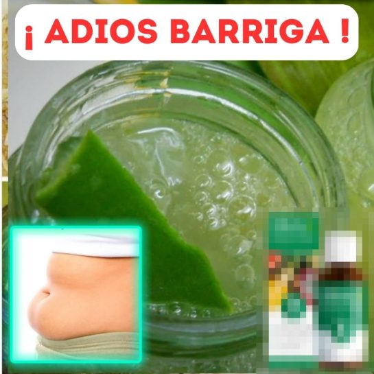
Green is associated with nature, health, and well-being. It's often used in call-to-action elements, making it a popular choice for weight loss creatives.


