- Joined
- May 7, 2018
- Messages
- 4,451
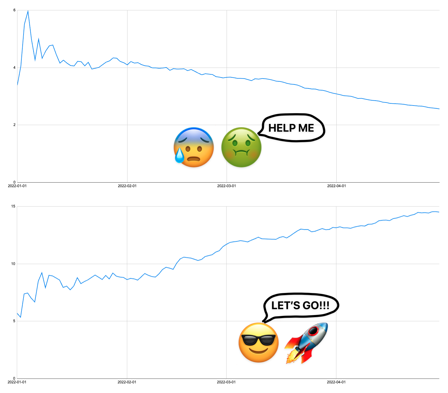
If you’ve got an email list, a cool thing you can do is visualize how your average email subscriber revenue goes up (or down) over time. Doing this lets you see if your efforts are helping or hurting you.

Today I’ll show you how you can visualize this using your own data that you can get from your tracker and/or email platform.
 Note: The data used in this post is fake and changes between screenshots because I’m using dynamic, randomly generated data, and just selecting cells changes all the data
  . Sorry about that.
The first thing we want to do is make a new Google Sheet. In this sheet, we’ll input our data and make a line chart to visualize the data.
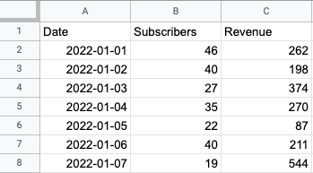
You’ll need to make a column for the date, the number of subscribers you gained, and the revenue you generated.

Fill it in with your data from your tracker and/or email platform. We'll wait.

Next, we’ll add three additional columns:

To
Today I’ll show you how you can visualize this using your own data that you can get from your tracker and/or email platform.
Build a Google Sheet
The first thing we want to do is make a new Google Sheet. In this sheet, we’ll input our data and make a line chart to visualize the data.
You’ll need to make a column for the date, the number of subscribers you gained, and the revenue you generated.

Next, we’ll add three additional columns:
- Total Subscribers
- Total Revenue
- Avg Rev Per Sub
To


